0
Skip to Content
Pauline Martinet
HOME
Data visualization
Writing
Interior Design
Webdesign
Scenography
Instagram
Newsletters
Portfolio
sgraffito
PLACES WE LOVE
FRECH AVEC UN C
EVENTS
Double Dragon
Bio/Contact
Pauline Martinet
HOME
Data visualization
Writing
Interior Design
Webdesign
Scenography
Instagram
Newsletters
Portfolio
sgraffito
PLACES WE LOVE
FRECH AVEC UN C
EVENTS
Double Dragon
Bio/Contact
HOME
Folder: VISUAL
Back
Data visualization
Writing
Interior Design
Webdesign
Scenography
Instagram
Newsletters
Portfolio
Folder: EDITION
Back
sgraffito
PLACES WE LOVE
FRECH AVEC UN C
Folder: DESIGN
Back
EVENTS
Double Dragon
Bio/Contact
Infographic illustrating political campaign financing, featuring portraits of politicians, charts of funding amounts, and mechanisms of campaign funding support. View fullsize
Bar chart depicting the number of medals won at the Olympics from 1900 to 2020 for the United States, United Kingdom, Germany, and Switzerland, with the US and Switzerland having the highest counts. View fullsize
World map illustrating democracy levels in 2018 with color coding for authoritarian, hybrid, imperfect democracy, and full democracy; includes graphs on global GDP and youth unemployment rates in 2008 and 2018, and data on youth unemployment in Latin View fullsize
A digital illustration of a crowded urban scene showing multiple buildings filled with numerous stylized people walking, standing, or sitting. View fullsize
Line graph depicting cybercrime trends over time, with two data series shown in blue and orange, annotated with labels like 'cyber crime,' 'ransomware,' 'phishing,' and 'data breach,' featuring peaks and valleys indicative of fluctuating activity lev View fullsize
Close-up of a colorful line graph with data points and percentage changes, showing countries such as China, USA, Japan, Germany, South Korea, and the Netherlands. View fullsize
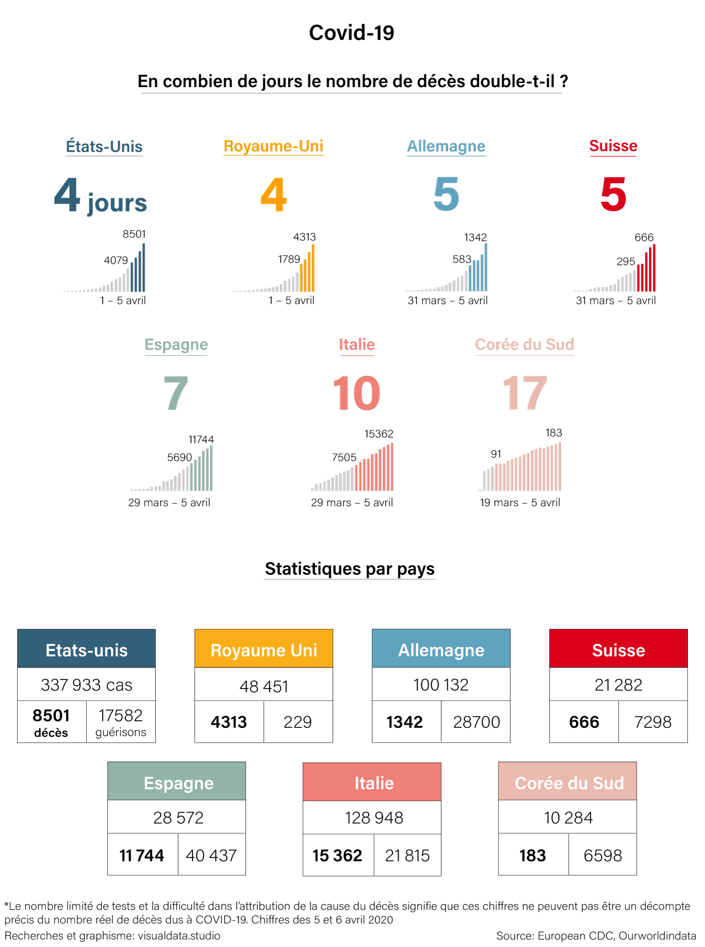
Map and infographic showing COVID-19 data. The map illustrates the number of cases in various countries in Asia with red circles indicating case counts, including China, Japan, South Korea, and others. The infographic displays total contaminations (2 View fullsize
A world map displaying the 2018 democracy index, with countries colored based on their political regime status: authoritarian, hybrid, flawed democracy, full democracy, or no data. Below, line and bar graphs compare gross domestic product and youth u View fullsize
A color-coded map of France showing voting percentages in favor of Marine Le Pen during the first round of the 2017 presidential election by department. The map uses shades of blue, beige, and gray to indicate different percentage ranges. Key locatio View fullsize
This infographic depicts the impact of aging on purchasing power and real estate prices in Switzerland, comparing data from 1997, 2017, and projections for 2050. It shows an increase in retirees and housing prices in Switzerland, a decline in Japan's View fullsize
Infographic showing rankings of Swiss universities based on academic research and reputation, with data on faculty and student numbers, across multiple institutions. View fullsize
Diagram of Mars, showing its surface and internal layers, a satellite orbiting it, and a lander on the ground with solar panels and instrumentation for scientific measurements. View fullsize
Map showing locations of Rohingya refugee camps in Bangladesh, highlighting the Kutupalong expansion site and other camps with circle sizes indicating refugee populations, and a small inset map of Bangladesh for context. View fullsize
Map showing water pipelines in Zurich, Switzerland, with existing blue lines and planned expansions marked in red dashed lines, and a pie chart illustrating water sources and their proportions. The chart details groundwater, surface water from nine t View fullsize
Map showing human migration out of Africa, with key dates and locations including Jebel Irhoud, Florisbad, and Karmelgebirge, and details about fossil findings of early humans like Misliya, Skhul, and Qafzeh. View fullsize
Map of the Sierrre-Zinal trail showing elevation points and distances between locations with an illustration of hikers. View fullsize
Infographic comparing soy and corn production in the United States, including crop details, land use maps, and food production statistics. View fullsize
Infographic showing sleep and tranquillizer use in Switzerland among 200,000 people. Includes pie charts illustrating problematic use and demographic breakdowns, with pills floating in the background. View fullsize
An infographic in German showing Switzerland's self-sufficiency in food, illustrating the percentages of plant-based foods, animal-based foods, and total food in 2015, along with data on the country's self-produced and imported meat, eggs, poultry, s View fullsize
A chart showing forest coverage in Sweden divided into categories: Utility forests, mountain forests, bog forests, agricultural land, and others, with respective areas in thousand square kilometers and percentages of private ownership. View fullsize
Infographic showing the process of skin regeneration over 8 months, starting with an unhealthy skin condition, infection by a virus, cellular changes, transplantation of new skin cells, and progressive change in skin color pattern at 0, 4, and 8 mont View fullsize
Illustration of a DJ with headphones behind turntables and a mixer, with a crowd of silhouettes dancing in front, against a gradient background, accompanied by German text and statistics about rave culture. View fullsize
Comparison of the NFL teams Philadelphia Eagles and New England Patriots, showing statistics on Super Bowl achievements, franchise value, and player profiles of Nick Foles and Tom Brady, with team logos and football imagery, on a green background. View fullsize
Graphs showing worldwide trends of COVID-19 cases and deaths from January to July 2020 with separate data for specific countries such as the United States, Brazil, India, Russia, and Italy. View fullsize
Pie chart showing the proportion of problematic benzodiazepine use in Switzerland's population, with separate pie charts for men and women indicating the problematic consumption rates among different age groups. Background features scattered pills. View fullsize
Infographic illustrating political campaign financing, featuring portraits of politicians, charts of funding amounts, and mechanisms of campaign funding support.
Bar chart depicting the number of medals won at the Olympics from 1900 to 2020 for the United States, United Kingdom, Germany, and Switzerland, with the US and Switzerland having the highest counts.
World map illustrating democracy levels in 2018 with color coding for authoritarian, hybrid, imperfect democracy, and full democracy; includes graphs on global GDP and youth unemployment rates in 2008 and 2018, and data on youth unemployment in Latin
A digital illustration of a crowded urban scene showing multiple buildings filled with numerous stylized people walking, standing, or sitting.
Line graph depicting cybercrime trends over time, with two data series shown in blue and orange, annotated with labels like 'cyber crime,' 'ransomware,' 'phishing,' and 'data breach,' featuring peaks and valleys indicative of fluctuating activity lev
Close-up of a colorful line graph with data points and percentage changes, showing countries such as China, USA, Japan, Germany, South Korea, and the Netherlands.
Map and infographic showing COVID-19 data. The map illustrates the number of cases in various countries in Asia with red circles indicating case counts, including China, Japan, South Korea, and others. The infographic displays total contaminations (2
A world map displaying the 2018 democracy index, with countries colored based on their political regime status: authoritarian, hybrid, flawed democracy, full democracy, or no data. Below, line and bar graphs compare gross domestic product and youth u
A color-coded map of France showing voting percentages in favor of Marine Le Pen during the first round of the 2017 presidential election by department. The map uses shades of blue, beige, and gray to indicate different percentage ranges. Key locatio
This infographic depicts the impact of aging on purchasing power and real estate prices in Switzerland, comparing data from 1997, 2017, and projections for 2050. It shows an increase in retirees and housing prices in Switzerland, a decline in Japan's
Infographic showing rankings of Swiss universities based on academic research and reputation, with data on faculty and student numbers, across multiple institutions.
Diagram of Mars, showing its surface and internal layers, a satellite orbiting it, and a lander on the ground with solar panels and instrumentation for scientific measurements.
Map showing locations of Rohingya refugee camps in Bangladesh, highlighting the Kutupalong expansion site and other camps with circle sizes indicating refugee populations, and a small inset map of Bangladesh for context.
Map showing water pipelines in Zurich, Switzerland, with existing blue lines and planned expansions marked in red dashed lines, and a pie chart illustrating water sources and their proportions. The chart details groundwater, surface water from nine t
Map showing human migration out of Africa, with key dates and locations including Jebel Irhoud, Florisbad, and Karmelgebirge, and details about fossil findings of early humans like Misliya, Skhul, and Qafzeh.
Map of the Sierrre-Zinal trail showing elevation points and distances between locations with an illustration of hikers.
Infographic comparing soy and corn production in the United States, including crop details, land use maps, and food production statistics.
Infographic showing sleep and tranquillizer use in Switzerland among 200,000 people. Includes pie charts illustrating problematic use and demographic breakdowns, with pills floating in the background.
An infographic in German showing Switzerland's self-sufficiency in food, illustrating the percentages of plant-based foods, animal-based foods, and total food in 2015, along with data on the country's self-produced and imported meat, eggs, poultry, s
A chart showing forest coverage in Sweden divided into categories: Utility forests, mountain forests, bog forests, agricultural land, and others, with respective areas in thousand square kilometers and percentages of private ownership.
Infographic showing the process of skin regeneration over 8 months, starting with an unhealthy skin condition, infection by a virus, cellular changes, transplantation of new skin cells, and progressive change in skin color pattern at 0, 4, and 8 mont
Illustration of a DJ with headphones behind turntables and a mixer, with a crowd of silhouettes dancing in front, against a gradient background, accompanied by German text and statistics about rave culture.
Comparison of the NFL teams Philadelphia Eagles and New England Patriots, showing statistics on Super Bowl achievements, franchise value, and player profiles of Nick Foles and Tom Brady, with team logos and football imagery, on a green background.
Graphs showing worldwide trends of COVID-19 cases and deaths from January to July 2020 with separate data for specific countries such as the United States, Brazil, India, Russia, and Italy.
Pie chart showing the proportion of problematic benzodiazepine use in Switzerland's population, with separate pie charts for men and women indicating the problematic consumption rates among different age groups. Background features scattered pills.